Thursday, November 1, 2012

Jewel Tones

It's no secret that I love color.  I always have, it's just something that makes me happy.  Color inspires me to be creative.  When I see a well designed room with rich, vibrant colors, it evokes an immediate reaction.  Pair color with texture and well, it's like I've died and gone to heaven.  But while I like color, my favorite colors are jewel tones.  Jewel tones are intense, rich, and highly saturated (meaning that the hue is dominant; a color like grey would have very little saturation). They are modeled after precious gems.  Interiors that have a good command of jewel toned colors leave me feeling as though I've just visited a special place. Here are a few "special places" I love. 

Excellent job of blending the citrine, garnet, teal and aubergine
tones in this space. 
Image courtesy of www.blog.decoratingden-ma-nh-me.com

Jewel toned pillows set against neutral window treatments and
upholstery works beautifully.
Image courtesy of www.yourdecoratinghotline.com

Varying shades of violet blend perfectly in this
lapiz living space.
Image courtesy of www.entertainingchic.com

Tuesday, October 30, 2012

Edelman Leather

Last week, I attended an event at the Edelman Leather showroom in Washington, DC.  I've worked with Edelman in the past and am always eager to learn about their new products and services.  The event was an overview of the basics of leather, much of which if I tried to explain here would probably be too technical but it was a great refresher and I walked away with a couple great ideas for different leather applications.  I've taken the liberty of posting pictures from the showroom and a couple of my favorite Edelman leather applications from the web. 


Edelman Leather at the Washington Design Center in DC.
Photo courtesy of http://www.facebook.com/nicole.dolan.edelmanleather.

A wonderful, colorful sea of texture and color options.
Photo my own.
More showroom.  How interesting is that lilac calfskin rug?!
Photo courtesy of http://www.facebook.com/nicole.dolan.edelmanleather


Love this Edward Ferrell + Lewis Mittman chair
with a natural fur hide!
Photo my own.

Genuine python skin and crocodile embossed calfskin.
Photo my own.

A fantastic Cavallini cappuccino ottoman with a
red baseball stitch.
Photo my own.


Calf hair rug with a smooth leather border.
Photo my own.

French blue leather doors in an
interior designed by Miles Redd.
Photo courtesy of www.saffroniabaldwin.com

Monday, October 29, 2012

Doing It Myself

When it comes to my design projects, I very rarely actually "do" anything myself.  Understand, I do design the spaces.  I develop the ideas and concepts but as far as the labor, I usually leave that to the professionals.  On a couple of occasions, I've been asked to paint or re-upholster.  I usually decline as I'm not as skilled as a professional painter or upholsterer but on the rare instance that a close friend or family member asks, I have been known to say, "yes". The most recent instance of this resulted in me hauling out the Bernina and sewing.

Before you get any ideas, I am far from a professional seamstress.  Growing up my mom would show me a few things here and there, and in my later years, I've taken a few lessons but that's as far as my ability and knowledge extends.  The fact that I even have a sewing machine results from a random stroke of luck when I expressed to a former coworker that I wanted to take lessons and she volunteered to not only give me lessons but also give me her mom's old Bernina Sport 801.  Since those lessons, the Bernina has been sitting in my closet inactive until Tuesday of last week.

Tea and the Bernina Sport 801.
Photo my own.

I'm sure you're wondering how 4 years passed between obtaining a machine and actually pulling it out the closet last Tuesday, and if you're not wondering, then just amuse me and continue reading.  Back around the first of the year, I designed a small condo project.  The client (also my dear friend) bought some fabric for throw pillows and I committed to making the throw pillows myself, saying that I needed to throw my proverbial hat back in the sewing ring.  Fast forward 10 months later, the fabric was still sitting at the end of my bed staring at me and daring my unprofessional sewing hand to make throw pillows for the very professional interior I designed.  Now do you understand my reluctance?  I finally decided to bite the bullet and get on with my impending sewing failure.

Fabric
Photo my own.
Giving you my best "I know what I'm doing" pose.
Photo my own.
My sewing adventure took 2 days (about 4 hours of intermittent work) from start to completion, I've posted pics of the final product below. I've also posted a few pics of me doing other labor intensive stuff, you know, just for your amusement.

Finished products!
Photo my own.

A happy and coordinating client!
Photo my own.

Upholstering dining chairs.  Seen here cutting
new fabric using existing fabric as pattern.
Photo my own.

The fun part...using a staple gun!
Photo my own.

More fun...using the drill to anchor the seat
cushion to the chair frame.
Photo my own.

Finished product!
Photo my own.
Painting.  Ugh. Definitely not my favorite
DIY thing.
Photo my own.

Finished product!
Photo my own.

Friday, October 26, 2012

Walker Zanger

Earlier this week, I participated in a twitter chat for folks that work in the interior design community, i.e. #IntDesignerChat.  This week's chat was hosted by none other than the VP of Walker Zanger, Jared Becker (@WalkerZanger).  The chat centered around participating interior designer's finding what inspires them and how technology assists with inspiration.  By the end of the chat, I was inspired to pull up some of my favorite Walker Zanger tile creations and pull together a blog post.  Which are your favorite Walker Zanger tile designs? 

Walker Zanger Sonja La Fleur Tile Mosaic
Image courtesy of www.trendir.com


Walker Zanger Vibe Odyssey mosaic
Image courtesy of www.pinterest.com/WalkerZanger/Walker-Zanger-Tiles/

Walker Zanger Skyline Linear Field in Mink
Image courtesy of www.pinterest.com/WalkerZanger/Walker-Zanger-Tiles/

Walker Zanger Tracciato Circolo Tile in Gold Leaf
Image courtesy of www.walkerzangerblog.com

Wednesday, October 24, 2012

Carrara White vs. Calcutta Gold


I love white marble.  It always makes everything seem so crisp and clean.  I see a lot of designs where Cararra White marble is used and while it is very similar to Calcutta Gold in that the background is mostly white with a bit of grey veining, what differentiates Calcutta Gold from Cararra White is that within the veining are these lovely gold tones that add warmth to the stone. I think I love them both equally but I do like the uniqueness and rarity of use of Calcutta Gold.  Here are a few images of both stones.  Which do you like better?


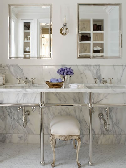
Carrara White used as a wainscot, vanity top and flooring in a bathroom.
Image courtesy of www.deuxmaisons.com
Carrara White used to line shower walls, vanity backsplash
and vanity top.
Image courtesy of www.seattletimes.com


Carrara White used in shower, bathroom walls and vanity top.
Image courtesy of www.picasaweb.google.com/aposhgirl
Carrara White marble slabs.
Image courtesy of www.bagm.com

Calcutta Gold backsplash and countertop.
Image courtesy of www.evadesigns.com

Calcutta Gold Vanity Top.
Image courtesy of www.decorpad.com


Calcutta Gold marble slab.
Image courtesy of www.inmanparkmarble.com

Monday, October 22, 2012

Unexpected Ingenuity

I really love the idea of incorporating non-traditional pieces into various living spaces.  I think it provides a bit of that unexpected ingenuity that makes people say, "Hey, why didn't I think of that?".  When I stumbled across these two images, I totally wished I had designed these spaces first.  What do you think?

Image courtesy of www.bhg.com

Wednesday, October 17, 2012

Interior Design Blunders That Drive Me Crazy!

Photo courtesy of www.juiceit.wordpress.com


In my day to day travels and interactions, I see a ton of interior design blunders that drive me crazy.  I’m way too polite to speak about it at the time but not so polite that I won’t write about it now.  Here are five interior design blunders that I encounter quite often. 

1. Hanging Wall Décor Too High or Too Low.  The top of any wall art or mirror should be hung anywhere from 66” to 72” above the finish floor.  The idea is that the center of the art or mirror should be at eye level.  For a taller person, the center may be a bit below eye level and for a shorter person, a bit above.  Hanging too high or too low is just awkward and makes me wonder if the owner really intended for anyone to look at or in the hung object. 
2.  Buying without measuring.  Unless you are an actual experienced design professional, thinking you can ogle whether something will fit in your space is a huge mistake.  The story of Goldilocks is alive and well.  Many homeowners buy furniture that is either too big or too small for the room where it will live.  The best advice I will ever give to someone looking to become a DIYer is to measure.  I can never say it enough.  (Related:  Measuring all doorways the furniture will have to travel through to arrive in the designated space, is never a bad idea, either.)
3.  Not considering how you use your space.  Furniture should be arranged such that it does not impede the flow of traffic.  The color of paint and home furnishings should all be selected after considering the natural and artificial lighting in the space.  If you live with small children or pets, select fabric and furniture treatments and colors that will wear well over time.  Climbing over or around furniture to enter/exit is dangerous and realizing the paint looks completely different from the swatch once you put it up in your space is disappointing. 
4.  Too little or bad lighting.  After you’ve taken the time to select a paint color and arrange your furniture, nothing discredits your efforts more than bad lighting.  Bad lighting can make or break a space.  In dim or low lighting, paint, fabric, and furnishings may look different than they did when you purchased them.  I’ve heard the protest many times, “But I like dim lighting…,” which is all fine and dandy but it’s important to also have options.  Your guests shouldn’t feel like they are visiting a candlelit cave.  Layering your lighting will allow you to create the right atmosphere for all of your entertaining needs.
5.  Bad paint jobs.  I always appreciate when someone has stepped out on a limb and chosen a wild paint color; lime green, orange, turquoise, fuchsia, etc.  What I don’t appreciate is when they’ve taken the risk and then done a terrible paint job.  Paint on the ceiling, rough wall patches, cracks, splotches, etc. I’ve seen it all. Nothing makes a wild paint color look cheaper than an awful paint job.  It’s what I call terrible follow through. 

The above five blunders are very common but they don’t have to be.  Consider, measure, consult, hire. Repeat as necessary.